Logo Design - What makes a good one?
16 March 2009Isn’t that the question to end all questions – 'What makes a great logo'?
Despite having been in the business for over fifteen years and having been involved in the development of countless logos (both as the designer myself and working with other designers) it's still a difficult question.
However I’ve boiled it down to five main ingredients that should form the basis of any logo:
1. It should be descriptive:
The logo should give the viewer a good ‘feel’ for what the company or brand is all about. This doesn’t mean that it needs to provide a complete run down of the company mission statement, product line and philosophy, rather it should set the ‘tone’ for what it’s about.
2. It needs to be memorable
Goes without saying really.
3. It's effective without colour.
Whilst colour is an effective communicator, it should always be treated secondary to shape and form. I always leave colour to the end of the design process, because if the mark doesn't work in black and white, no amount of colour will rescue it.
4. It's scalable i.e. works as well in small sizes as in large
Both points 3 and 4 are important to remember for when you’ll be wanting to use the logo on items such as office stationery (fax headers and business cards) and promotional goods (pens, magnets, t-shirts etc.), as these items can be easy to overlook.
5. It's appropriate.
Finally, the design must be appropriate for the business or product it seeks to identify. This is accomplished through in-depth research into the industry involved, and helps to differentiate from closely associated competitors.
Here’s a couple of logo designs we’ve completed recently:

Mrs Molly Coddle is an online and party-plan company that sells products for babies and young children.
When they approached us to design their new logo they told us that their customer base were ‘modern mums or mums-to-be who didn’t respond to traditional baby imagery like stalks, nappy pins, pinks and blues etc.’
So with this in mind we created a simple, symbol like mark that used a more contemporary font style and colour, whilst conveying the idea of mother and baby.
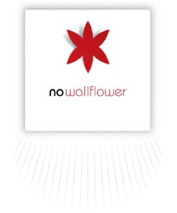
No Wallflower is an online fashion boutique that sells designer clothing for women who like to stand out from the crowd.
The client wanted a logo that would communicate the idea of a boutique and resonate with women who have a go-getter spirit and want to be noticed.
If you would like to know more about how Propeller can help you develop your brand, call us today on 3286 3963
Where To From Here?
Feel free to give us a call, email, or use our contact form to discuss your project and how we can help you.

